Wondering what to include in your maps? This guide, acting as your compass, outlines 33 map elements that will steer you in the right direction, helping you craft impressive maps.
It’s time to create maps that make you an instant expert, garner positive feedback, and enrich your portfolio with top-notch cartographic designs. Crafting high-quality maps requires time and effort, tailored to user needs. However, certain elements consistently appear in map-making, leading us to compile this comprehensive mapping checklist. Let’s delve into the details:
Clearly Defined Map Purpose
Every map should have a distinct intention, guiding its design. Whether depicting geology, census data, or watersheds, the map’s purpose aids readers in spatially understanding a theme or subject.
Reflective Map Title
The map title should align with its purpose, incorporating the theme and geographic location. A clear title communicates the map’s intention to readers.

Appropriate Template Usage
Utilize available map templates, adjusting elements as needed for a quick and efficient map creation process. Consider landscape or portrait orientation based on the map features.
Inclusion of Company and Client Logos
Recognize the author and client by adding their logos to the map. Always seek permission when using logos or names.
Correct Map Extent and Coverage
Understand the scale of your map and ensure it accurately represents the data. Consider the extent and coverage to provide readers with a comprehensive view.
Defined Map Projection
Select a map projection based on your priorities, be it preserving area, direction, or scale. Clearly list the chosen projection in the map’s metadata.
Display of Correct Content
Verify the accuracy of the data used in your maps to maintain correctness and reliability. Thoroughly check and confirm that you are linking to the correct file.
Perspective Enhancement with Inset Map
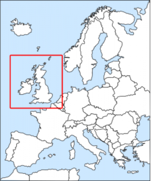
Inset maps offer perspective, showing the map’s extent concerning a larger area. They can also focus on specific regions, providing readers with additional context.
Key Map – A Hierarchical Approach
Use maps within maps to convey ideas effectively, especially for large-scale projects. This hierarchical approach offers readers varying perspectives on the same subject.
Thoughtful Labeling/Annotation
Place labels purposefully, following a left-right and south-north orientation. Consider font face, color, and size, ensuring labels enhance rather than clutter the map.

Neat Lines for Reader Engagement
Neat lines provide a solid border, keeping readers engaged with the map. While not always necessary, neat lines can enhance the map’s overall appearance.
Layer Organization by Importance
Arrange data layers logically to ensure that important features are displayed correctly. The hierarchy of layers determines the visibility of features on the map.
Comprehensive Legend for Map Understanding
Legends act as a guide, explaining map symbols and features. Keep legends clean and aligned, following the order of points, lines, and polygons.


Length Measurement with Scale Bars
Scale bars graphically represent distances on a map, aiding readers in understanding scale and measurements.
Production Date Awareness
Include the date of map production to convey the relevance of the information. It helps readers understand the timeliness of the data.
Metadata as Map’s Narrator
Metadata provides a summary of the map’s data, acting as a narrator for readers. Include information about the spatial data to enhance the map’s storytelling.
Orientation Clarity with North Arrow
North arrows provide orientation by pointing to the geographic north cardinal direction, helping readers align themselves with the map.

Complete Surrounding Map Data
Fill in voids on the map with base map imagery from services like Google, Bing, or OpenStreetMap to maintain visual harmony.
Appropriate Disclaimer Inclusion
Address legal repercussions and liabilities by including disclaimers on the map. It provides protection in case of unforeseen issues.
Thorough Data Sources Information
List all data sources used in the map to provide transparency. Insert footnotes with author and year details similar to a thesis paper.

Guidance with Graticules
Graticules serve as guides for horizontal and vertical measurements, aiding readers in understanding latitude and longitude positions.
Consistent Symbology Usage
Use symbology consistently to convey the cartographic language effectively. Inconsistent symbols can lead to confusion.
Appropriate Scale Symbology
Adjust symbols based on the map’s scale, ensuring they are intuitive and convey information accurately.
Theme-Reflecting Color Selection
Select colors that align with the map’s theme and purpose, enhancing visual clarity and relationships between features.
Diversify Map Types
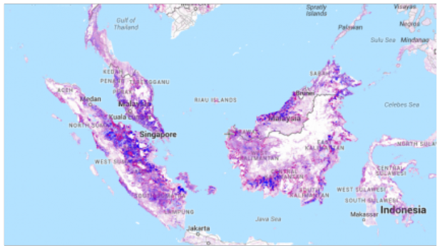
Choose the right map type for the information you want to convey. Different map types, such as choropleth or climate maps, serve specific purposes.
Careful Typeface Selection
Consider legibility when selecting typefaces. Base features can use Times New Roman, while thematic features may benefit from Arial, depending on the map’s style.
Limit Features for Clarity
Avoid overcrowding the map with unnecessary features to maintain a clear and communicative purpose.
Italicize Water Features
Differentiate water features by italicizing text, adding a dynamic touch to the map.
Prevent Text Overlaps
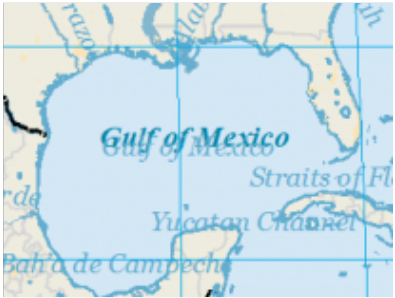
Ensure label placement avoids overlaps for improved readability. Use contrast and halos to enhance text visibility.
Include Author’s and Reviewer’s Names
Add the cartographer and reviewer names to the map for acknowledgment and pride in the work.
Run a Spell Check
Check for correct spelling in place names, legend items, and metadata to maintain the map’s professionalism.
Legend Inclusion for Every Feature
Ensure all features on the map are labeled and included in the legend. Maintain a good practice of singular legend items.
Achieve Balance & Harmony
Learn to organize map elements to achieve visual balance and harmony. Balance is crucial for a well-designed cartographic layout.
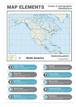
This checklist provides a solid foundation for creating meaningful and effective maps. What other essential map elements do you think we missed? Share your thoughts in the comments below.
