Some maps are timeless, capturing a moment in history that remains unchanged. Others, however, are dynamic, reflecting the passage of time. These temporal maps can be challenging to display effectively. That’s why we’ve compiled this list of 10 innovative ways to showcase time in maps.
Static Timestamps
Static timestamp maps are straightforward. Each map includes a specific date or period. When you place them side-by-side, you can easily compare the differences over time.
For example, election maps can vividly illustrate which party came to power and highlight newly formed states. This type of temporal map is incredibly useful for showcasing changes over time.

Time Sliders
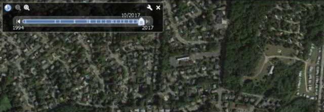
Got an interactive map? Incorporate a time slider at the bottom or side of the map. This feature is commonly used to view changes like urban growth, deforestation, or sea-level rise. Users can adjust the time frame and select the period they want to explore. For instance, they can align specific periods based on their geographical extent.
Animated Maps
Animated maps bring changes over time to life. They include overlapping layers that can be toggled on and off, allowing for easy comparison of different periods. Time series animated maps are perfect for visualizing weather patterns, the spread of an epidemic, or historical territorial changes.

Flow Maps
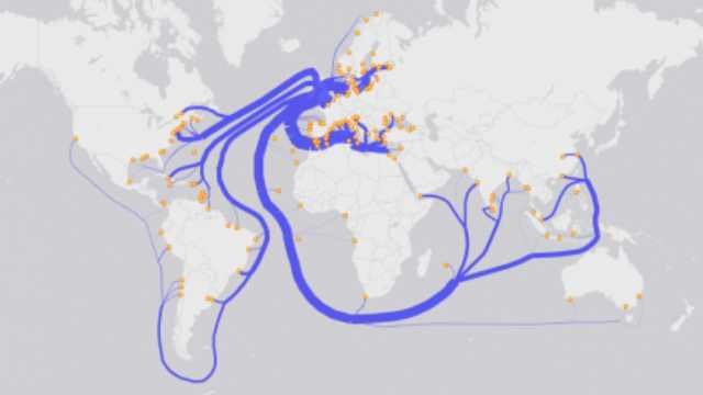
Flow maps illustrate how things move over time using arrows or lines of varying thickness. Each arrow or line shows the direction and volume of movement over time. You’ll often see flow maps for migration patterns, trade routes, or traffic flow, showing where things start and end, and adding the dimension of when.
Space-Time Cube Maps
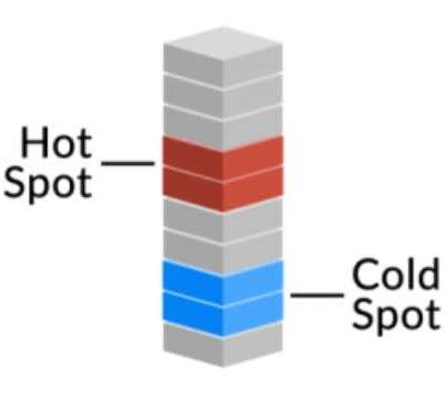
Space-time cubes display data across both space and time within a 3D framework. Although used sparingly in GIS, they are ideal for showing patterns in geographical space. In this model, the horizontal axes represent latitude and longitude, while the vertical axis corresponds to time. Each cube is a slice of time with a value associated with it.
Swipe and Spyglass Maps
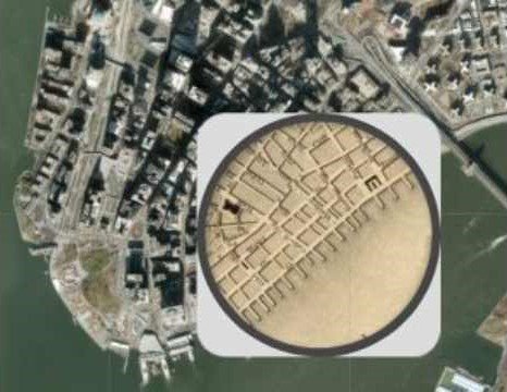
Imagine having two maps layered on top of each other. With a “swipe” feature, you can slide back and forth to reveal different eras of time. This is particularly useful for comparing before and after scenarios, such as the impact of natural disasters. Alternatively, magnifying glass maps allow you to hover a virtual spyglass over a map. As you move the spyglass, you can compare different time periods within the same area.
Event Markers
Event markers are a straightforward way to show time on maps. Simply place markers on a map, each with labels that include dates and descriptions. This method is especially common in web maps, as it allows users to explore significant events in a spatial context.
Time Spirals
While it might be debatable whether this is a map, the Geologic Time Spiral visual from the USGS is one of the most unique designs. It showcases all the geologic eras throughout history, from the Paleozoic to the Cenozoic eras, each with its distinct periods. This customized design stands out for its ability to display vast amounts of historical data in a visually engaging way.

Temporal Charts
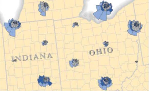
Temporal charts involve embedding charts like line graphs or Coxcomb charts directly within maps. This approach provides geographic context to the temporal data, allowing for a direct visual correlation between spatial data and its changes over time.
Isochrone Maps
Isochrone maps are used to show travel time within a specific timeframe. They display how reachable areas are from a specific point, not just by driving but also by bicycle or on foot within a given duration. This type of map is particularly useful for urban planning and transportation analysis.


