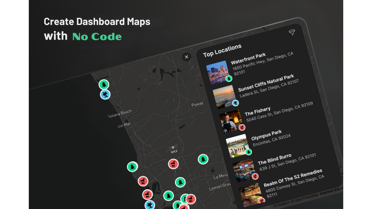
Are you thinking about making a map dashboard but unsure which platform to pick? No worries! We’ve got you covered.
Today, we’re going to talk about our favorite map dashboards. We’ll show you examples and talk about what makes each one special. Let’s dive in!
Best Map Dashboards – Quick Look
Here’s a table that shows what each dashboard is best for and what makes it stand out:
| Dashboard | Best For | Standout Feature |
|---|---|---|
| ArcGIS Dashboards | GIS professionals | Speed and spatial data analysis |
| Tableau | Data visualization and business analysts | Interactive visualizations and ease of use |
| CARTO | Data scientists working with spatial analytics | Speed and access to geospatial datasets |
| PowerBI | Business intelligence, Corporate users | Integration with Microsoft products |
| QGIS Dashboard Plugin | Open source users with a GIS background | Integration with QGIS |
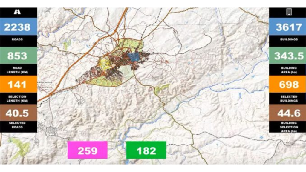
1. ArcGIS Operational Dashboards
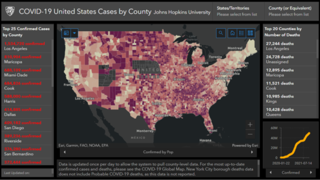
If you’re in the GIS industry, you’ve probably heard of ArcGIS Dashboards. It’s packed with features and even hosts the Johns Hopkins Covid Tracker! You can display maps, lists, charts, and more to understand data quickly. Plus, it has cool features like 3D mapping.
2. Tableau Dashboards
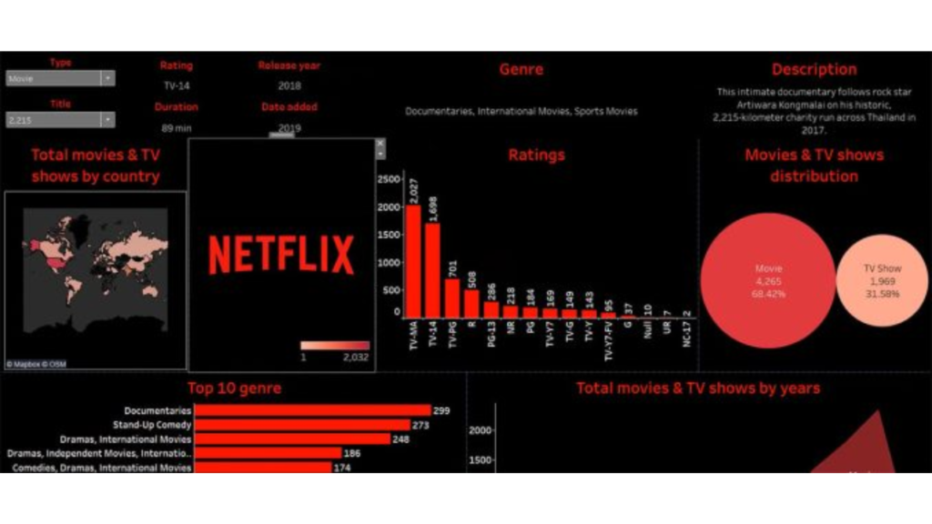
Tableau is great for making custom map dashboards. You can import different types of data and even create your own geographic overlays. It’s super interactive, making it easy to explore data like you would with a Netflix dashboard.
3. CARTO Dashboards
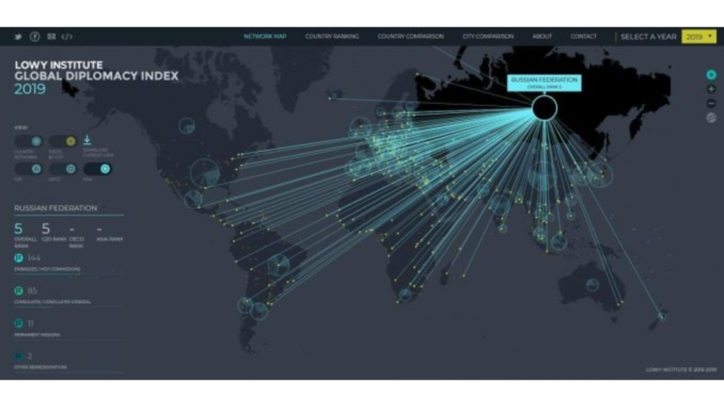
CARTO dashboards have a modern look and work really fast. They also give you access to tons of geospatial datasets. For example, Vodafone uses CARTO to make money from mobile event data! CARTO is all about making cool maps with widgets and charts.
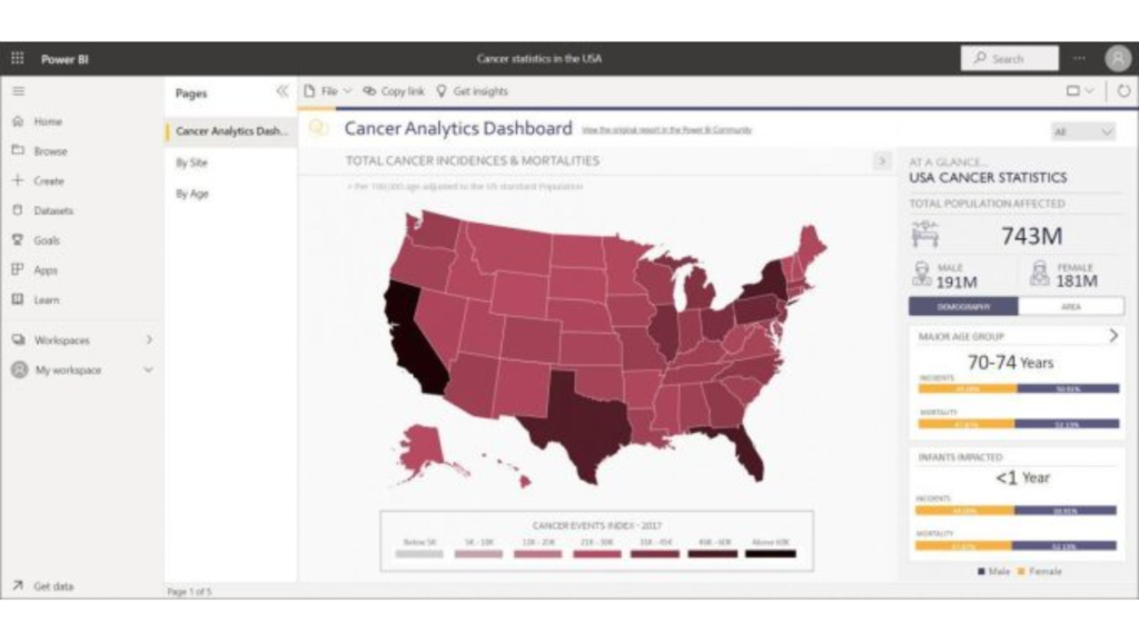
4. PowerBI Dashboards
If you’re already using Microsoft Office, PowerBI might be the way to go. It’s not as fancy as ArcGIS, but it gets the job done. Plus, it has a plugin that adds more features, like heat mapping.
5. QGIS Dashboard Plugin
QGIS is an open-source option for making map dashboards. It’s still new, but it’s come a long way. You can even use it with OpenStreetMap!
What About Mapbox and Google Maps?
Mapbox and Google Maps are popular mapping services, but they’re not exactly dashboard tools. However, you can still use them to make custom dashboards if you’re a developer.

Conclusion
ArcGIS is the top pick for map dashboards, but Tableau is a close second. CARTO is great for spatial analytics, while PowerBI is good if you’re already using Microsoft Office. And don’t forget about QGIS for open-source options!
Now it’s your turn! What do you use for your business intelligence dashboard? Let us know in the comments below!